ver.di Youth From an activists’ meeting to the Feminist Rage Club

Far more than just the name of an event: the Feminist Rage Club brings people together, fosters a sense of belonging and gives the feminist community within ver.di Youth a distinctive voice.
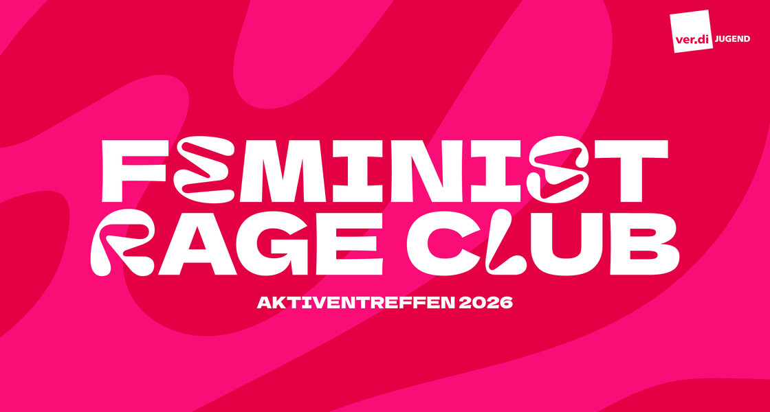
The ver.di Youth activists’ meeting in 2026 was held under the title “Feminist Rage Club”. We developed the slogan and visual identity for the event. From 27 to 29 March, FLINTA* people from all over Germany came together to exchange ideas, learn from one another and work together to strengthen feminist perspectives. Our task was to develop an event theme and an identity that would bring people together – both during the gathering and beyond.
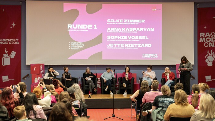
© photo: Katinka Schütt
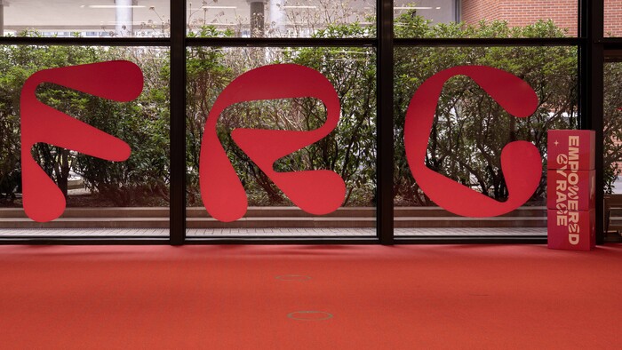
© photo: Katinka Schütt
Event design as a brand.
The Feminist Rage Club was never intended to be a fleeting trend. Instead, we developed a brand identity that will stand the test of time and grow alongside the community. We have created a design that conveys a sense of belonging and is visually inspired by a young, pop-culture aesthetic. It is loud, self-assured and uncompromising. The language used was developed collaboratively. We developed buzzwords and slogans together, thereby creating an authentic tone that reflects the community.
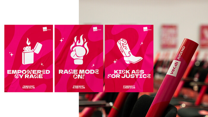
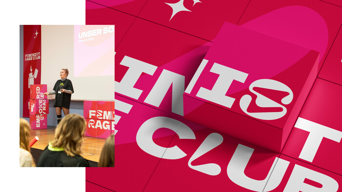
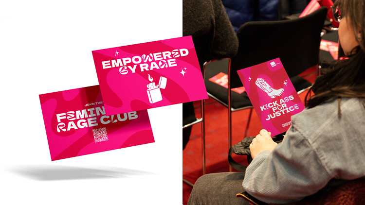
By combining two typefaces, we developed a distinctive visual language. Drawing on the flowing forms of the decorative typeface Pillowlava, we devised a flexible design system that uses varying letterforms to create dynamism, variety and a high level of brand recognition. Our brand kit included Canva templates, social media templates, presentations, icons and graphic elements. We also designed promotional items such as iron-on transfers, postcards and posters. Another key element was the design of the venue. Using stage banners, window decals and modular cube walls, we created a strong spatial identity and transformed the activists’ meeting into the Feminist Rage Club.
An identity that lives on.
The Feminist Rage Club doesn’t end with the activists’ meeting. The brand’s image is disseminated via social media, widely shared and embraced by the community. Merchandise and print products remain in circulation as visible symbols of belonging. The brand’s distinctive visual language, in particular, has been very well received. It translates feminist themes into a contemporary, powerful design that appeals to young people. In this way, we have created a brand that gives visible expression to a stance and brings people together.