ver.di Youth A familiar look, reimagined

For several years now, we have been supporting ver.di Youth with their social media communications. Together, we are constantly refining the channels and providing the trade union with both strategic and operational support. As part of this collaboration, we have comprehensively overhauled the existing social media design and adapted it to meet today’s requirements.
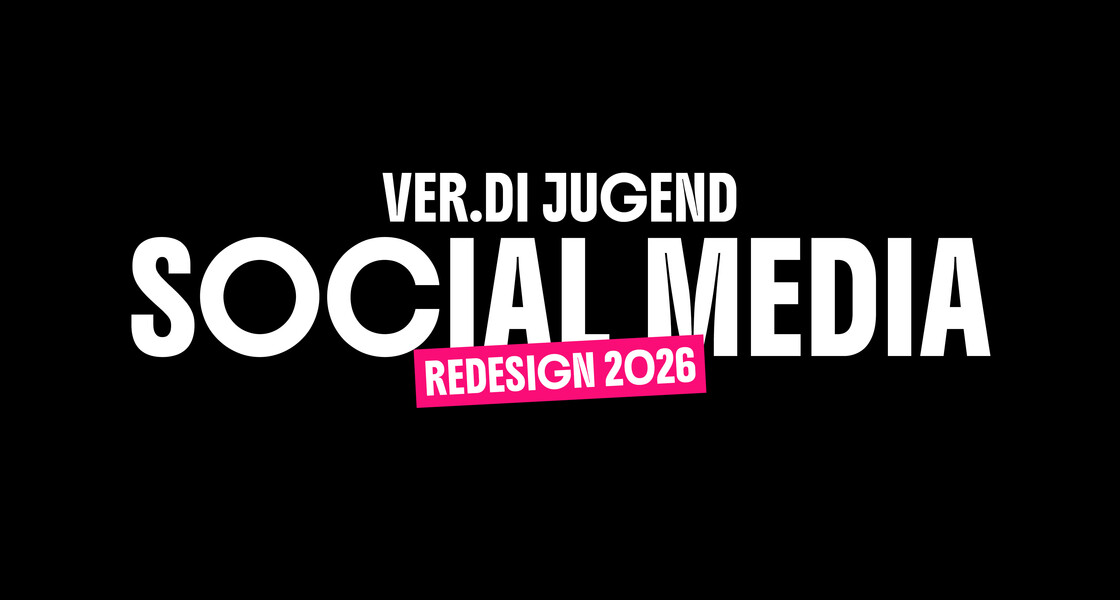
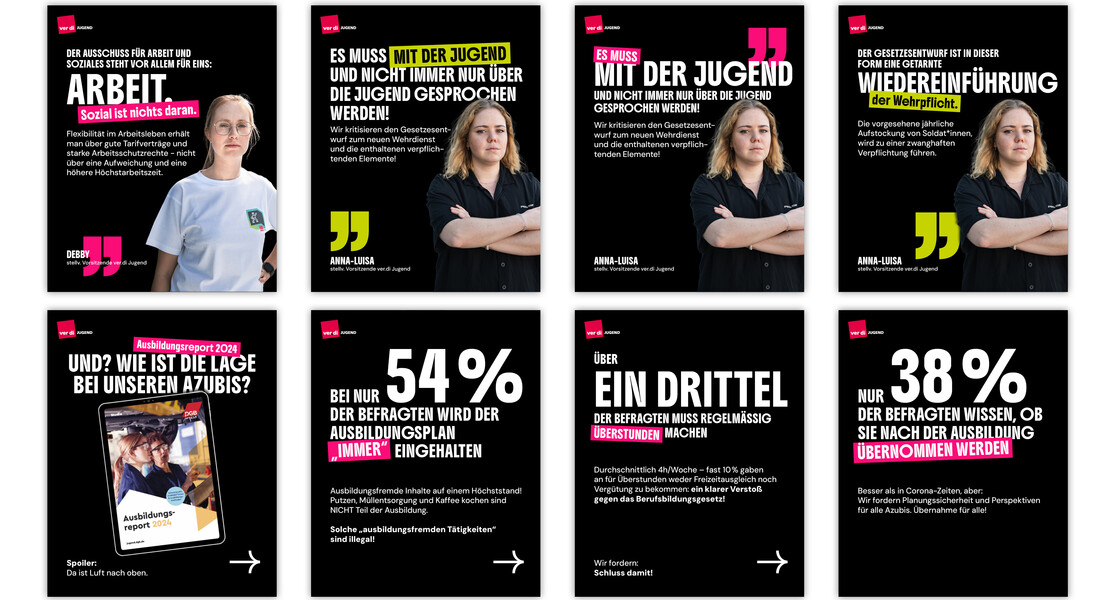
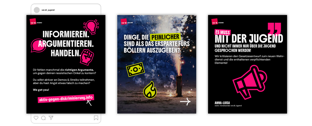
We deliberately simplified the visual identity, which had evolved over the years, without compromising the distinctive look of ver.di Youth. The new design focuses on clarity, structure and consistency. At the same time, it retains the union’s approachability and clear stance.
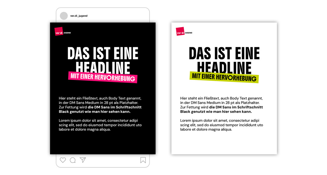
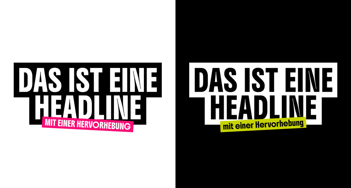
A design system for day-to-day editorial work.
As part of the redesign, we have streamlined the colour palette and focused on black, white and visual elements. Green and pink serve as accent colours and help users navigate the system. At the same time, we have modernised the typography and optimised it for readability. In addition, we have developed a new set of icons, the design of which is based on the typeface and complements the design system.
The result is a flexible design system that accommodates different content formats whilst ensuring a consistent brand identity. The templates can be used efficiently in day-to-day editorial work and offer sufficient scope for different types of content.
Rollout at all levels.
Right from the start, we designed the new look so that it could be used for social media communications not only at national level but also by the regional branches of ver.di Youth.
To ensure a smooth transition, we developed easy-to-use templates and ran digital training sessions. In this way, we enabled the teams to use the new design confidently on their channels. The templates are now being used at all levels, thereby helping to ensure a consistent image for ver.di Youth.