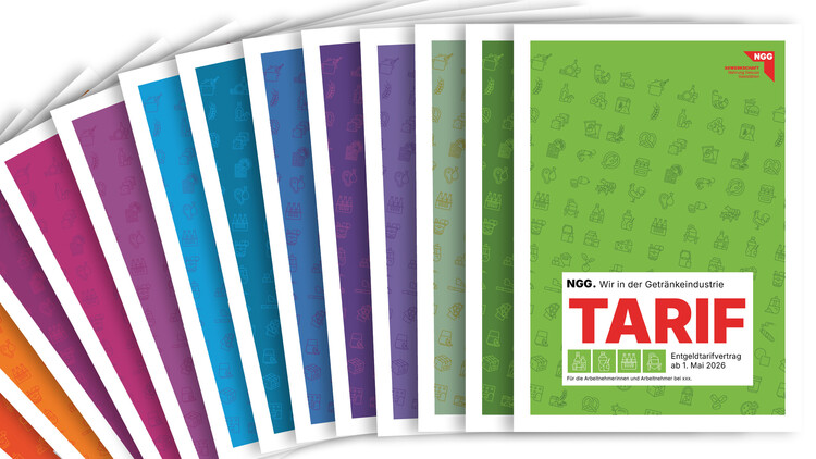
Gewerkschaft Nahrung-Genuss-Gaststätten (NGG) A real treat: the new corporate design for the NGG
The Nahrung-Genuss-Gaststätten trade union is one of the largest single trade unions in Germany. As a long-standing client of wegewerk, it commissioned us to further develop and modernise its existing corporate identity. The aim was to create a clear, contemporary look that would retain the union’s recognisability.
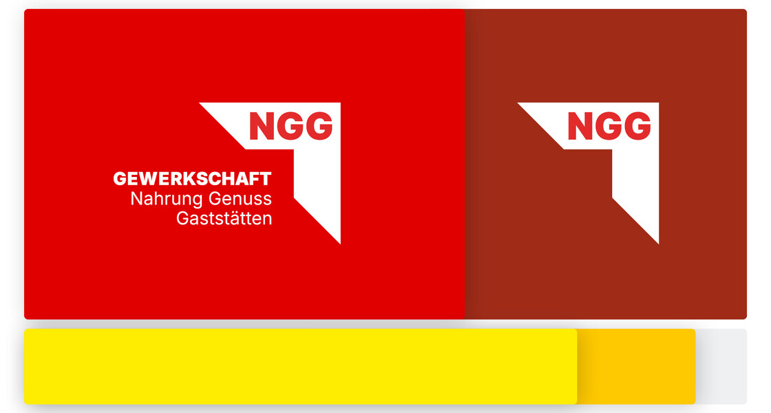
A new logo and a consistent design system.
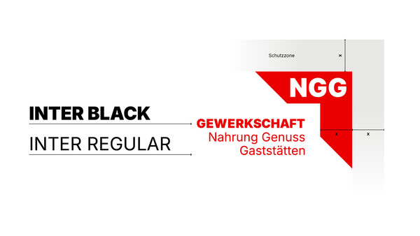
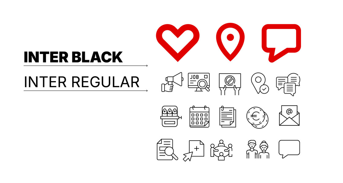
The challenge was to integrate the NGG’s existing design elements whilst developing a clearly structured, new design system. Our starting point was the redesign of the NGG logo, which we optimised for digital applications. With a new sans-serif typeface, it now has a simpler and more modern look. We retained the NGG’s tried-and-tested colours, but added an accent colour and redefined their weightings.
Consistent icons for clear messages.
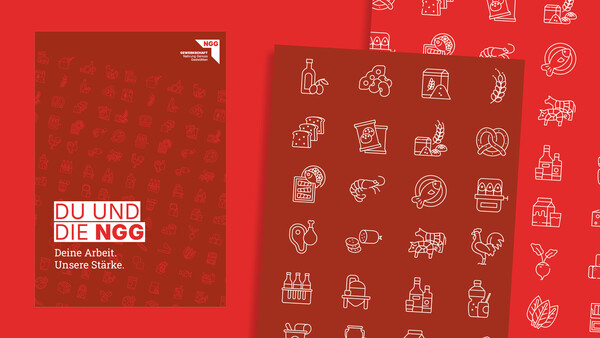
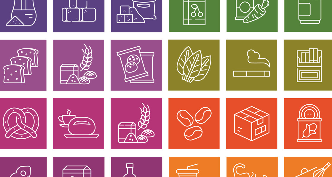
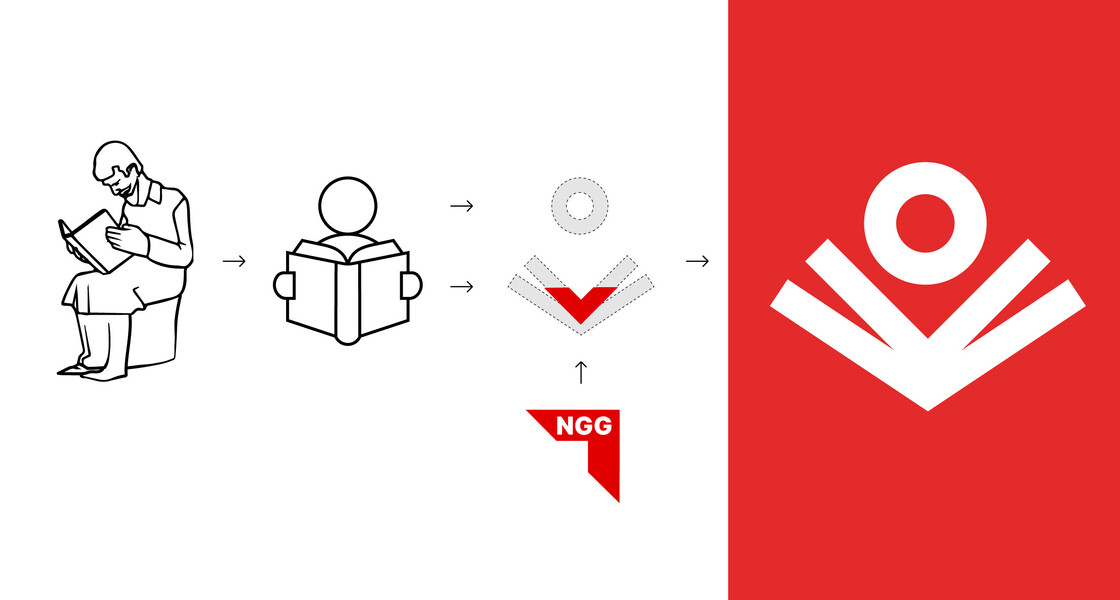
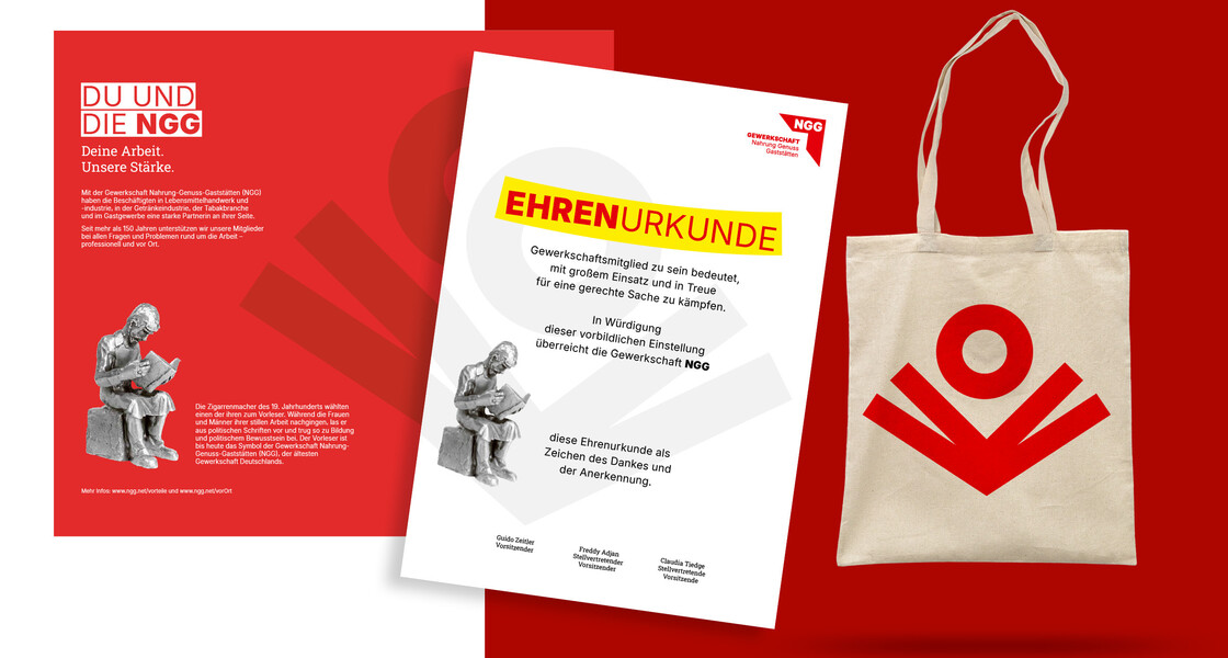
A further step was the standardisation of the icon system for the NGG sectors. Previously, there had been different styles and colour schemes used to represent the various sectors. We developed a consistent icon system with clear shapes and a uniform colour scheme. We also redesigned the traditional ‘Vorleser’ symbol – a historic NGG trademark that stands for solidarity, community and the fight for better working conditions. As a simplified icon, it serves as a modern symbol that can be used in various forms, both digitally and in print.
Design manual and templates for practical use.
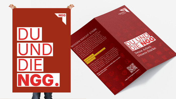
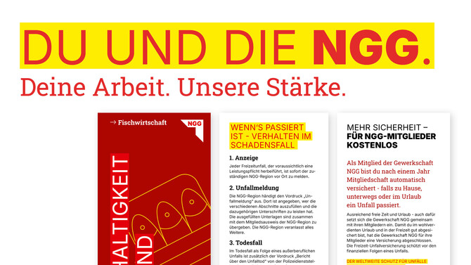
To ensure the long-term consistency of the new visual identity, we produced a comprehensive design manual. It sets out guidelines for the use of colours, typography, icons and key design elements. In addition, we developed numerous templates, for example for leaflets, certificates, membership forms and flyers. This provides the NGG with a flexible system that can be used easily and consistently in day-to-day operations.