404 error pages How to create a good 404 error page?
"404 - Page not found." Anyone regularly using the internet will be familiar with this error message. A small typo or an outdated link is usually enough to land you on the classic 404 page. In the best case scenario, however, it is designed in such a way that visitors don't jump off in frustration, but continue clicking with a good feeling. This works with a few simple measures.
Why have a 404 page at all?
If everything runs perfectly at all times, nobody will ever see the 404 page. In reality, however, it is used regularly. This is because the server responds with this error code if it cannot find a URL requested by the browser. The browser then passes this information on to the person who has obviously made a typing error or clicked on an outdated link.
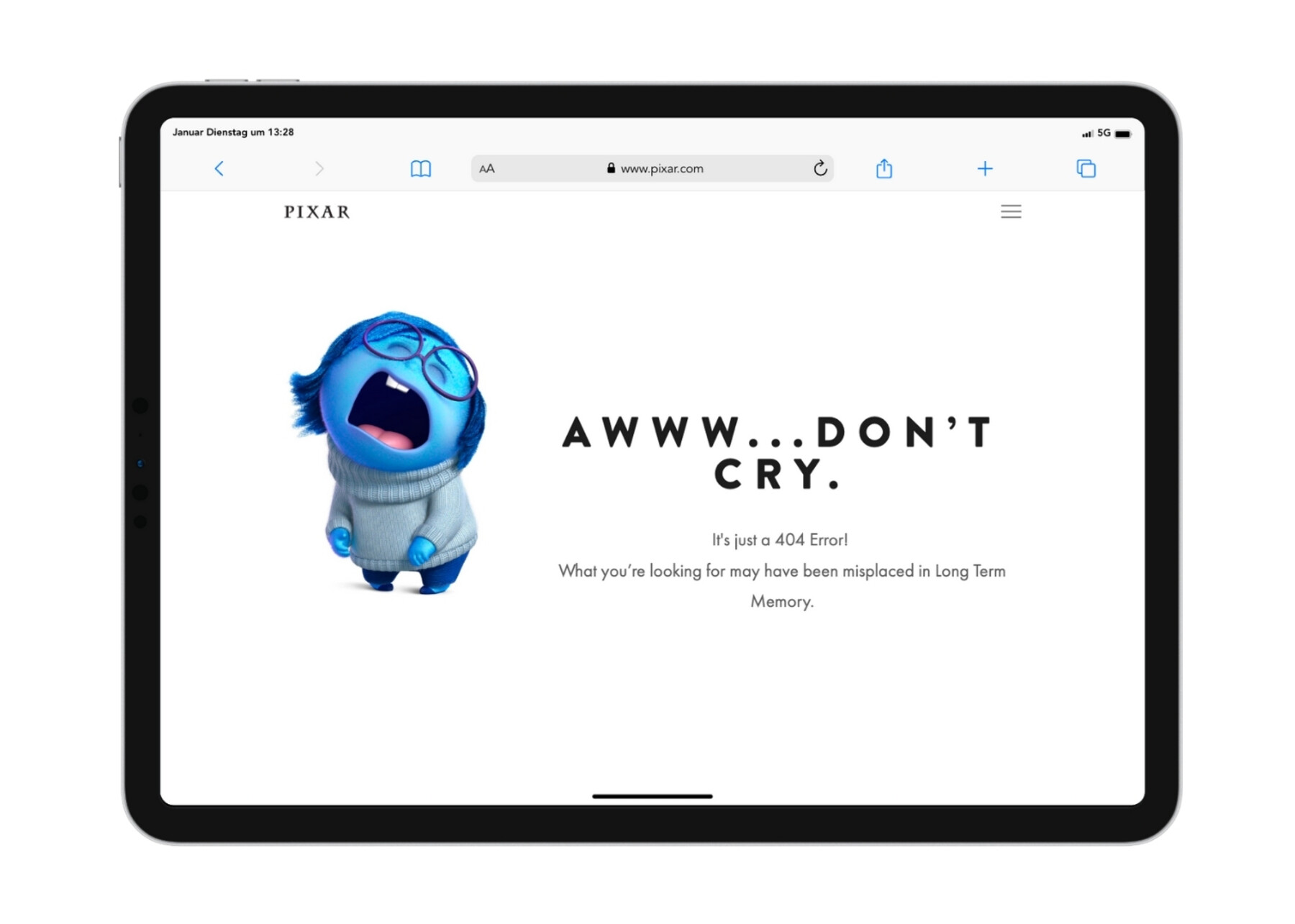
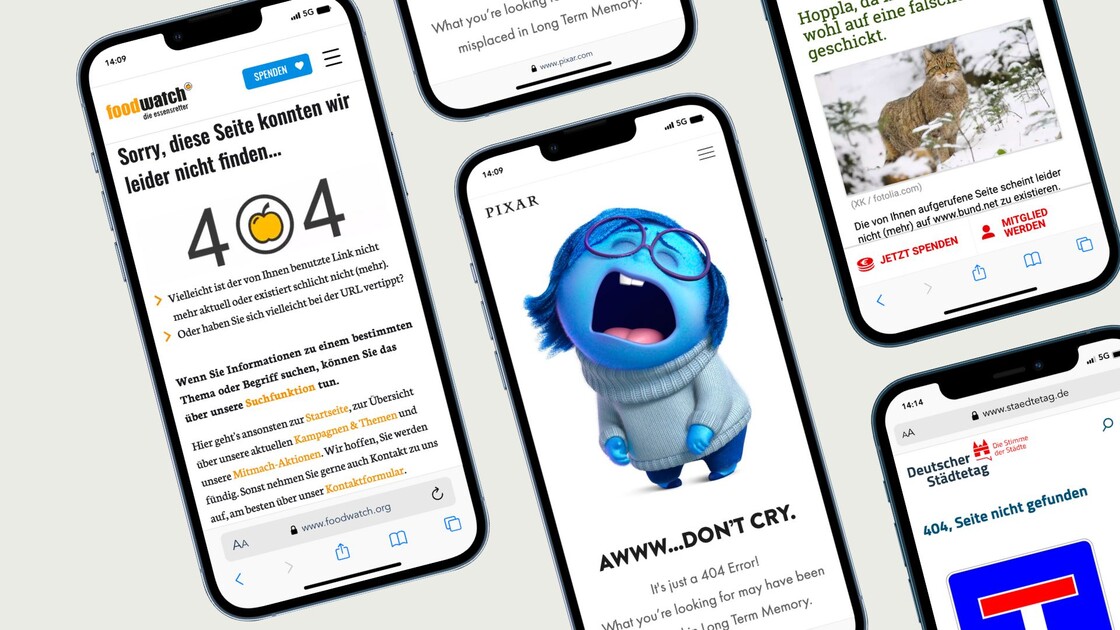
That's exactly how it feels! Pixar leaves it to Kummer from "Everything is upside down" to show the frustration of a 404 page.
This can easily put you in a bad mood - after all, nobody likes to get lost. And if a loveless standard 404 page is displayed, visitors' motivation is usually gone. They feel frustrated, annoyed and anything but welcome - and would rather leave the website altogether than continue their search.
Added value instead of frustration.
A well-designed 404 page can not only absorb frustration, but also offer real added value. It opens up an opportunity to present yourself as a company or organisation in a more playful way or with a wink, thereby strengthening your own brand. It also gives visitors the feeling that they are welcome and in good hands. And finally, it can also be used to direct where people click next.
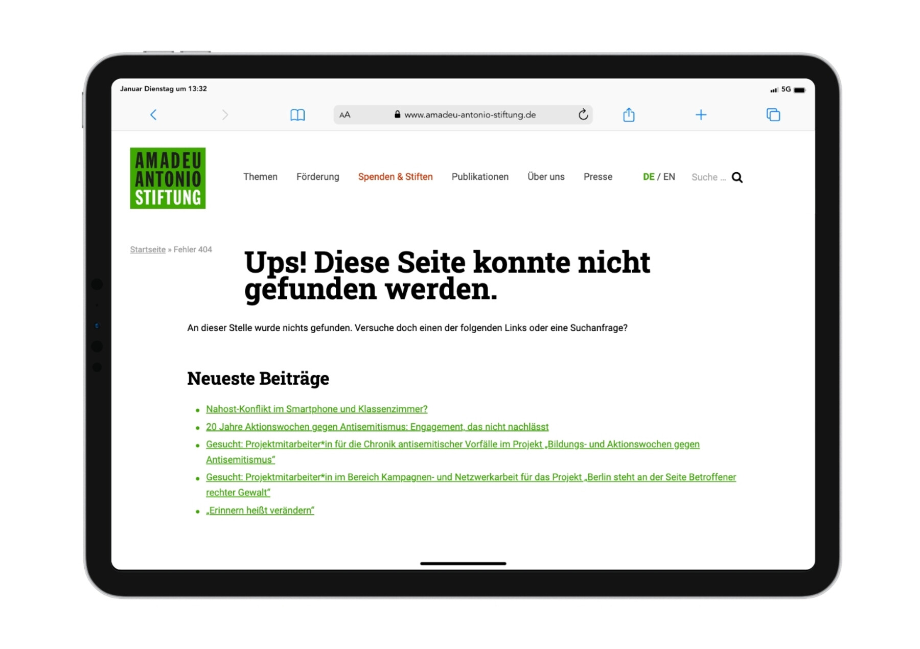
The Amadeu Antonio Foundation refers directly to important content.
It is therefore often worth rethinking your own 404 page. Firstly, there are fundamental questions to ask: Do we want to display a 404 page at all or does it make more sense in our case to redirect to the homepage, for example? How do we track this and similar errors and how can we fix them? Then it's all about the visitors, for whom the 404 page should be a good experience if they unexpectedly find themselves on it. Depending on the audience, the ideal page can look very different. However, some principles apply in any case.
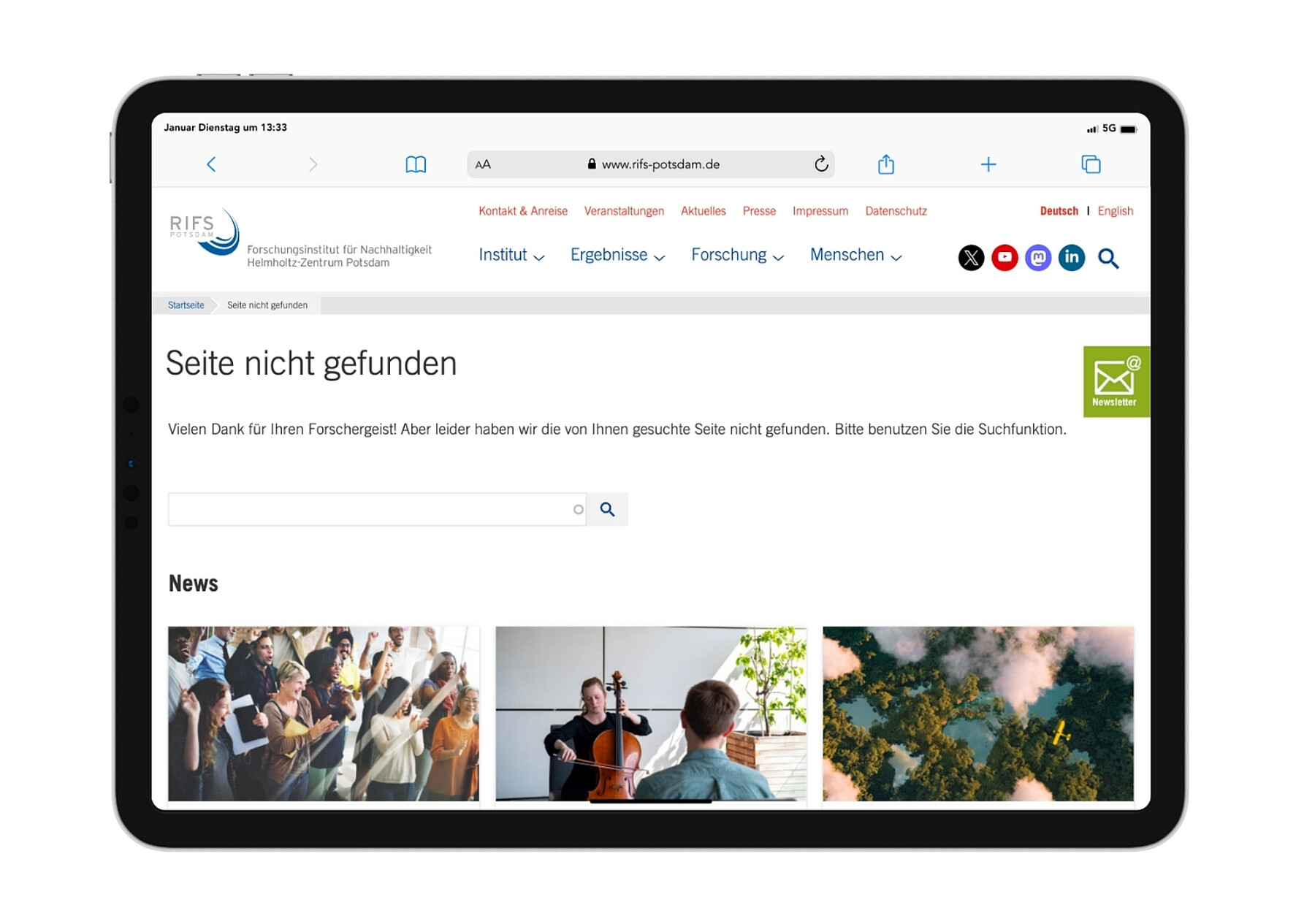
With a wink and a search function: RIFS Potsdam.
These are the 404 page essentials.
As much leeway as the design of a 404 page offers, some central elements are important:
1. Indication of the error
Very important: It must be clear at first glance that an error page is being shown here because the page actually requested cannot be found. This can be done with humorous paraphrases in the sense of "Oops, what happened here?", but it is usually advisable to clearly name the 404 error at the same time. This way, both web-savvy and web-insecure people understand what's going on.
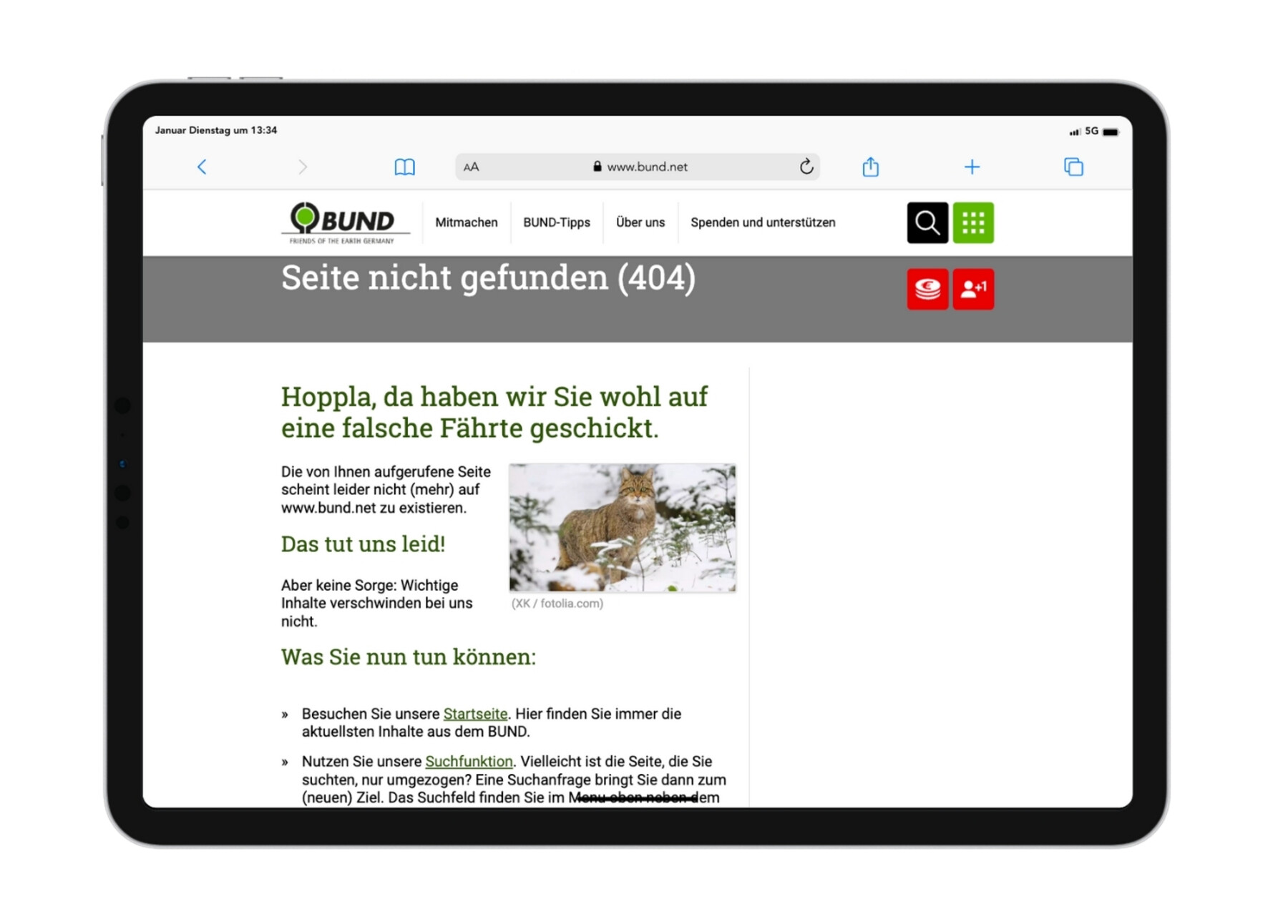
Animal pun at BUND.
2. Visual integration into the rest of the website
It is at least as important as pointing out an error that the page visually matches the rest of the website. This lets visitors know that they may not have clicked on the right thing, but that they have at least landed at the right company or organisation and are therefore in good hands. The classic way to do this is to display the main navigation and logo here too, so that the 404 page simply looks like a "normal" page with special content. However, it is also possible to create a more creative layout within your own corporate design. It goes without saying that the accessibility standards must be adhered to.
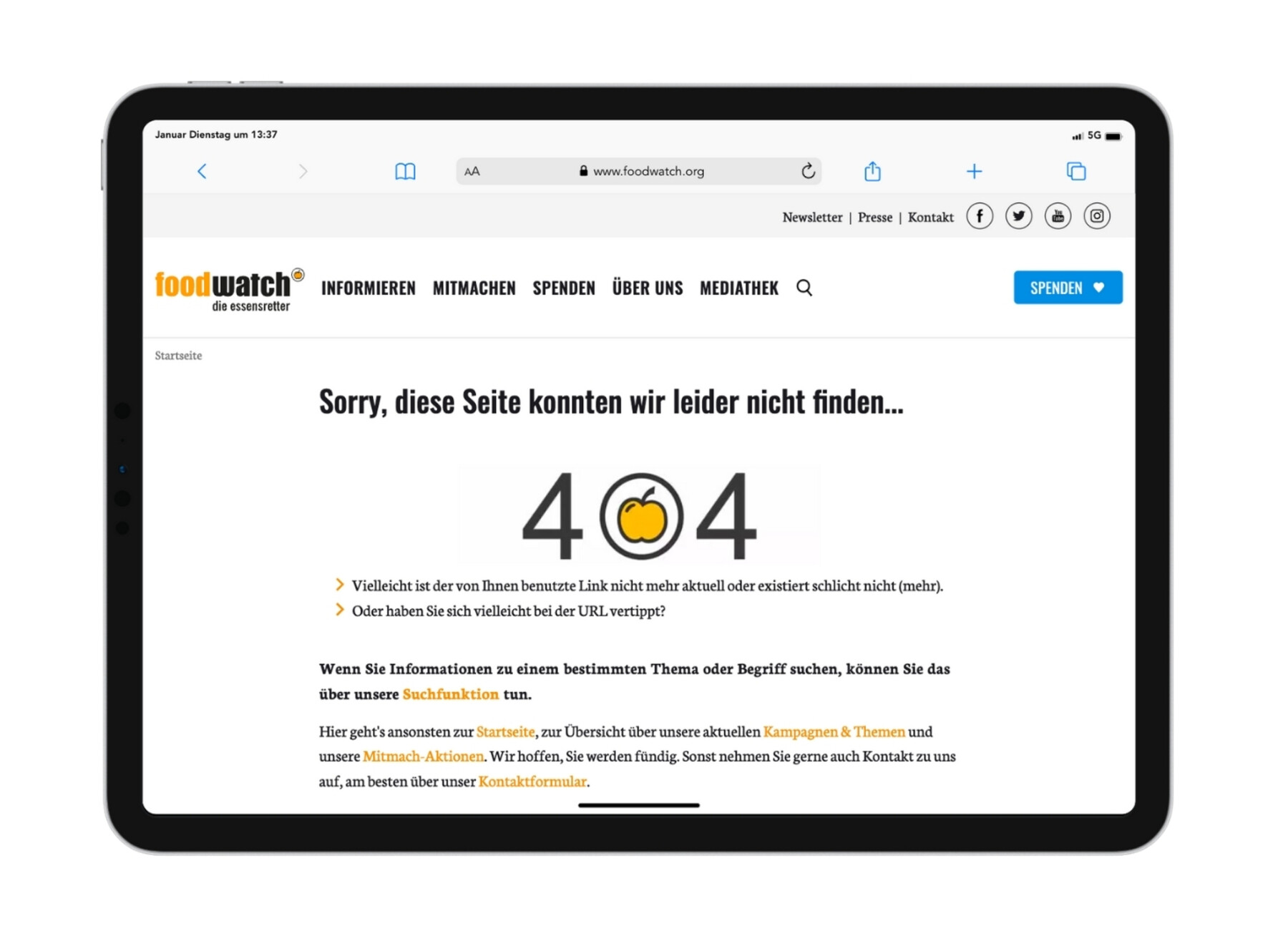
Clever integration of the logo on the 404 page of Foodwatch.
3. Search bar and further links
A 404 page should never be a dead end. The simplest solution to invite visitors to click further is a prominently placed link to the homepage. However, if you know your own audience, you can also take a more targeted approach and offer links to frequently clicked articles, a current campaign or the sitemap, for example. It can also be useful to not only integrate the search bar as part of the main navigation, but to either refer to it in text in the main section or to place the search field in the centre. And finally, you can also ask visitors for feedback by e-mail or form.
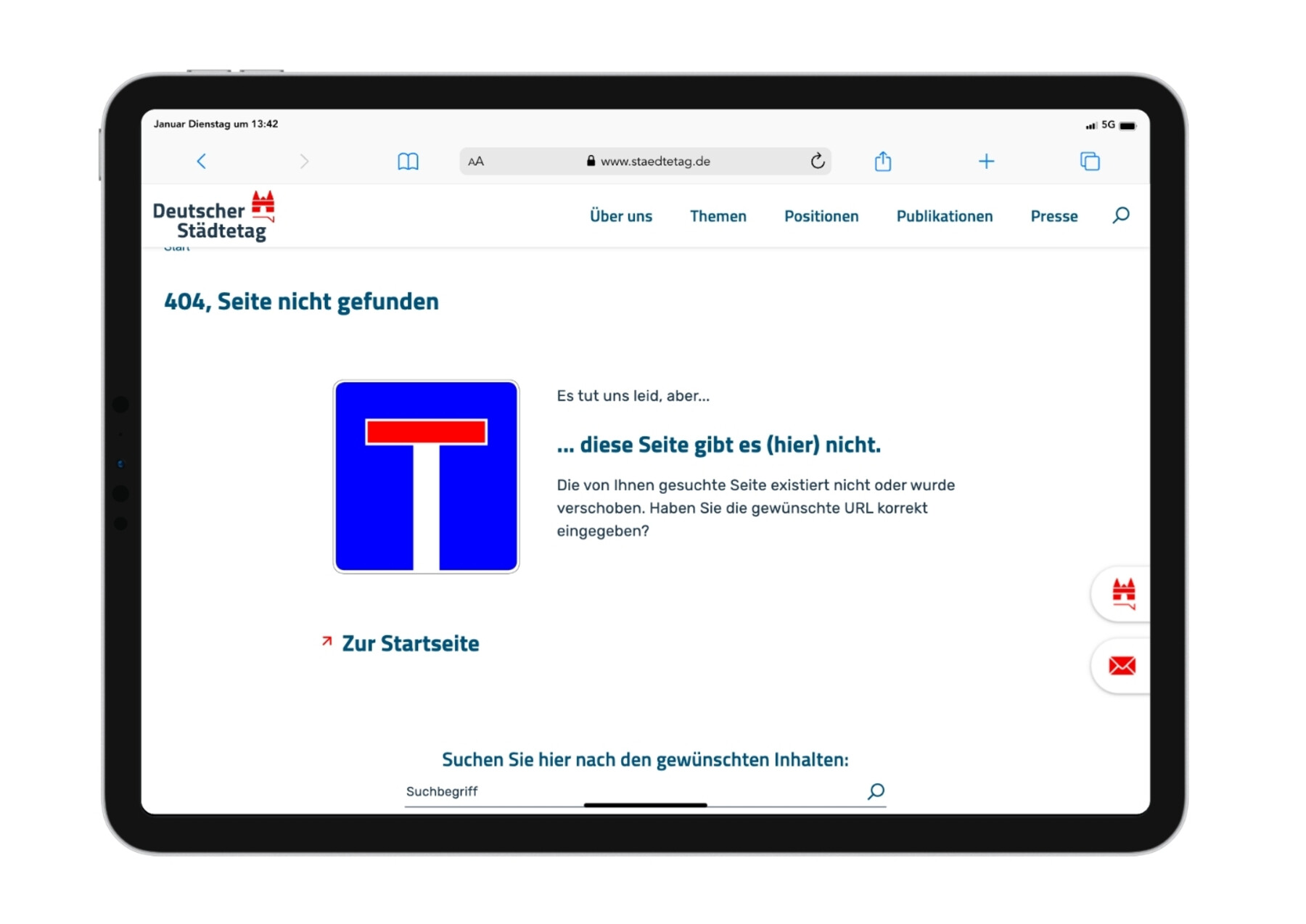
Dead end with a way out: Go to the homepage of the German Association of Cities.
Factual or funny? Finding the right approach.
And what is the best way to formulate a 404 page? After all, pages with that certain something - be it a funny picture, a clever slogan or an original link - are often particularly memorable. However, this only works if the tonality and visual language do not completely deviate from the rest of the website. For very serious topics, a factual approach is often the best choice. In general, however, rather dry or sober websites benefit from a pinch of humour on the 404 page.
Of course, the visitors are at the centre of the communication. Based on them, you can decide whether it makes sense to politely apologise for the missing page or whether an "oops" is just flippant enough to hit the common sense of humour. The important thing is that no one feels offended or left behind. A "Haha, you must have clicked wrong" may seem funny in some internet communities, but in others a "Sorry, we must have lost a page" will go down better.
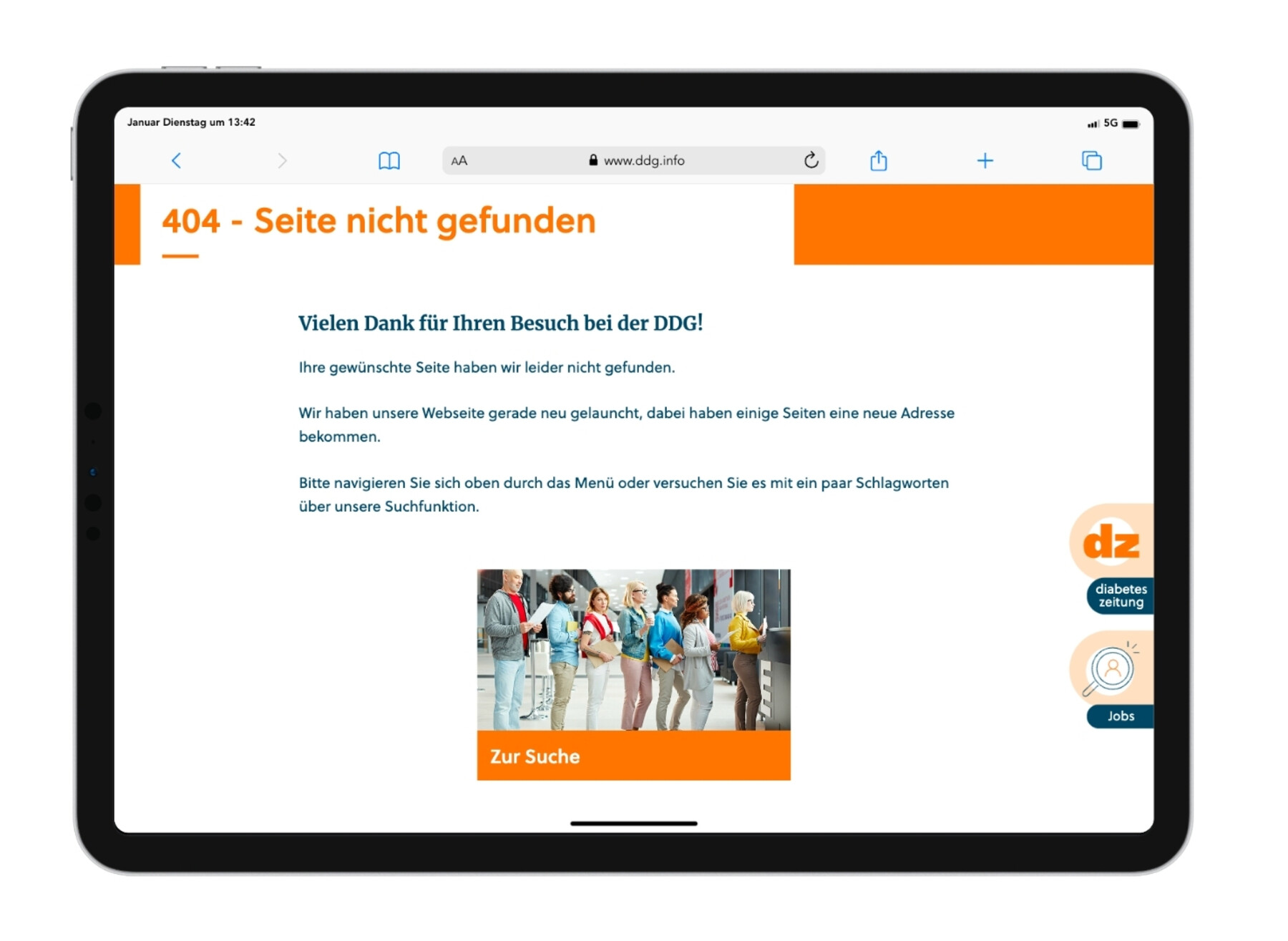
The German Diabetes Association provides background information.
Customised 404 pages.
When creating a truly original 404 page, it is often advisable to take your own product as a starting point in order to package the "This is as far as it goes" message appropriately. Perhaps a play on words from your own theme world is a good idea, or a mascot can be used here in a completely new way? On the other hand, an unexpected contrast can also have a particularly impressive effect, such as a deliberately old-fashioned page on a hypermodern website.
Here, too, it is important that the purpose of all the gimmicks remains clear. The best 404 page does not confuse, but emphasises your own appearance and turns an annoying situation into a good one. Lost for a minute, but found a little treasure in the process. Who doesn't want to continue like this?
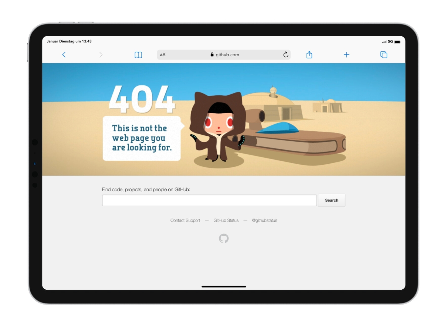
Github greets wrong-clicking programmers with a 404 page in "Star Wars" design.
Looking for a concept idea for your 404 page? We are happy to support you.