Centre for East European and International Studies Corporate Design and Website
The compass points east: logo design, corporate design, print material and a lean TYPO3 website including Rapidmail newsletter for the Centre for Eastern European and International Studies (ZOiS).
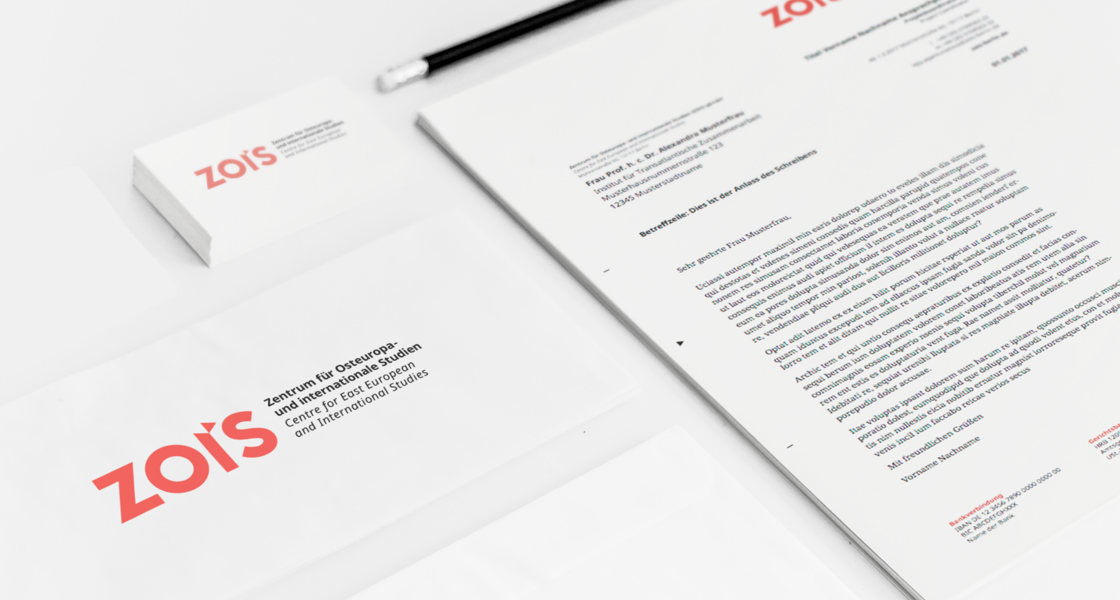
Everything from one cast: the ZOiS print design.
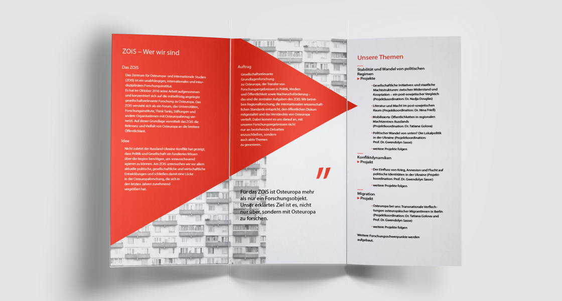
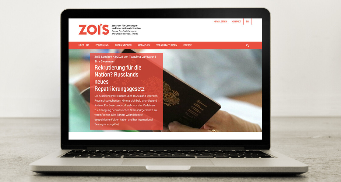
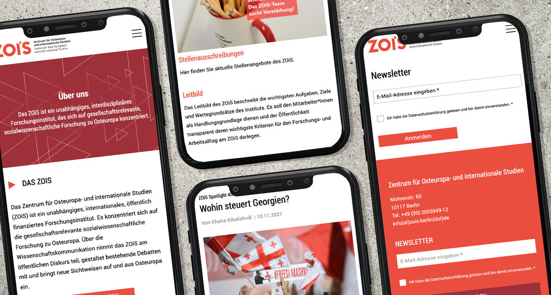
Modern, focused, open: Corporate design and website for the ZOIS.
The Centre for Eastern European and International Studies (ZOiS) is an independent, international and interdisciplinary research institute. Since October 2016, it has been bundling and promoting socially relevant research on Eastern Europe.
wegewerk took on the conception and implementation of the corporate design including logo design for the young institute and designed a modern and focused website on this basis.
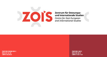
Warm red & compass key visual.
The core element of the logo and recurring design feature is the "compass needle" pointing east, which transforms the capital "I" into a lower-case "i" and thus represents the word mark "ZOiS" in correct spelling. Derived from the "compass needle", design elements of 30° angles in warm red and white characterise the graphic appearance of ZOiS.
Clear, airy web design with TYPO3.
We realised the website on a TYPO3 basis. It consistently avoids gimmicks and displays the content clearly, barrier-free and responsively. The integrated ZOiS newsletter works on the basis of Rapidmail and includes features such as icon-based anchor navigation and graphically appealing call-to-action buttons.
Ready for the office: ZOiS business stationery and print material.
To ensure that the ZOiS staff are also well equipped in the offline world, we have also created print material: With business cards, letterheads, invitation templates, institute and event flyers and a roll-up in the new design, the ZOiS team is also well positioned offline.
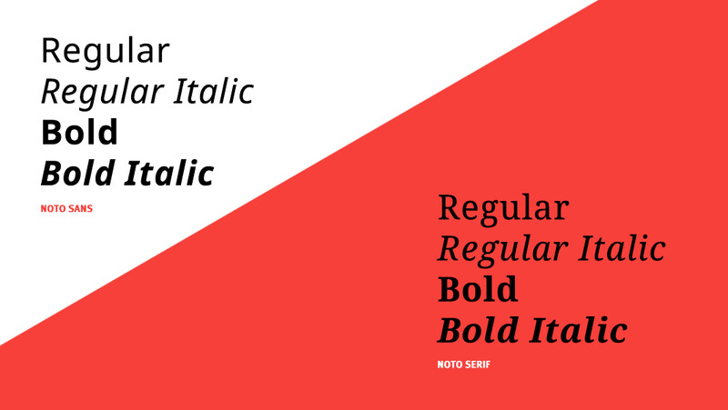
Als neue Hausschrift des ZOiS definierten wir die Typografie "Noto"